Informational Signs
Sweat the details














What are Informational Signs and Why Do I Need Them?
Informational signage refers to visual graphics, symbols, or text that convey information to an audience in a public space or building. Informational signage can be found in a variety of contexts, such as in museums, airports, hospitals, schools, and public transportation systems.
The purpose of informational signage is to provide clear and concise information to people who may be unfamiliar with a space or may need assistance navigating a complex environment. This type of signage typically includes directions, instructions, warnings, or other important information that helps people find their way, understand a process, or avoid potential hazards.
Informational signage can take various forms, including maps, diagrams, symbols, text, and images. Effective informational signage should be visually clear, easy to read, and consistent in design and messaging to ensure that the audience can quickly understand and follow the information being conveyed.
Why choose this sign type over another and under what circumstances?
Informational signage can be an effective way to convey important information and instructions to people in various settings. Here are some of the circumstances where informational signage can be particularly useful:
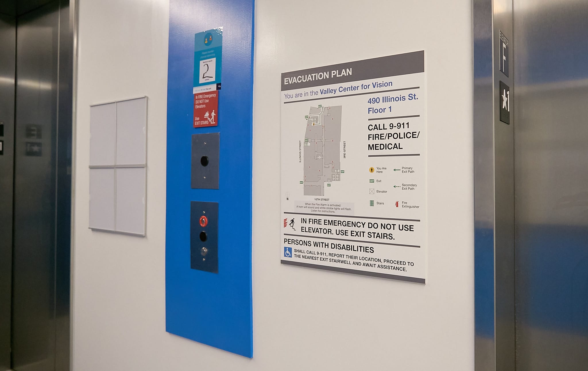
- Safety: Informational signage can help prevent accidents and injuries by providing clear instructions and warnings. For example, signage can indicate hazardous areas, identify emergency exits, or provide guidance on proper use of equipment.
- Directional: Signage can guide people through unfamiliar spaces, such as a museum or shopping mall, by providing clear directions to various points of interest. This can be particularly helpful for visitors who may not be familiar with the layout.
- Compliance: Signage can be used to communicate regulatory requirements or legal obligations. For example, a sign indicating a “No Smoking” area or “Wear a Mask” requirement.
- Education: Informational signage can educate people about important topics or provide historical context. For example, a museum exhibit may feature signage explaining the significance of artifacts or the historical context of an event.
Overall, informational signage is a useful tool to communicate important information and instructions to people in a variety of settings, particularly when safety, direction, compliance, or education are important factors.
Different Types of Informational Signs
Safety signs: Safety signs are used to communicate hazards and risks, and to provide instructions for avoiding accidents or injuries. These can include signs indicating the location of fire exits, warning signs for hazardous materials, or instructions for using safety equipment.
- Directional signs: Directional signs are used to provide guidance to visitors, such as indicating the location of restrooms, parking areas, or specific exhibits or attractions.
- Regulatory signs: Regulatory signs communicate legal or regulatory requirements, such as no smoking areas, speed limits, or parking restrictions.
- Educational signs: These signs are used to provide information or educate visitors on a particular topic, such as a museum exhibit or historical landmark.
- Advertising signs: Advertising signs promote products or services and are often found in commercial areas such as shopping centers and airports.
- Wayfinding signs: Wayfinding signs are used to help people navigate through complex environments, such as hospitals, airports, or large commercial buildings.
How Ad Art Does Informational Signs
Ad Art is all about value. We strive to be cost effective in everything we do so that every penny spent will bring optimal return on investment. Ad Art is known for creativity and innovation that helps set each customer’s sign apart from “ordinary” static signage. Quality, durability, and reliability are hallmarks of our products, which drives us to take pride in our work. We look good when our customers look good.
When it comes to designing and constructing informational signage, there are several best practices to keep in mind to ensure that the signage is effective, clear, and useful for its intended audience. Ad Art follows these key considerations:
- Keep it simple: Use clear, concise language and avoid using jargon or technical terms that may be unfamiliar to visitors.
- Use high-contrast colors and legible fonts: Choose colors that provide sufficient contrast between the text and the background to ensure legibility, and use fonts that are easy to read at a distance.
- Include images or graphics: Graphics can help reinforce the message of the signage and make it more visually appealing.
- Consider the location and viewing distance: Make sure that the signage is easily visible and readable from the intended viewing distance and angle.
- Ensure accessibility: Consider accessibility for people with disabilities, such as using Braille, large print, or audible signage.
- Test the signage: Test the signage with a diverse group of users to ensure that it is effective and easy to understand.
- Regular maintenance: Ensure that the signage is well-maintained and replaced as needed to prevent it from becoming outdated, damaged or illegible.
Overall, the goal of designing and constructing informational signage is to provide clear, effective communication to the intended audience, and these best practices followed by Ad Art help achieve that goal.
