Directionals & Wayfinding
Lead the way to your door







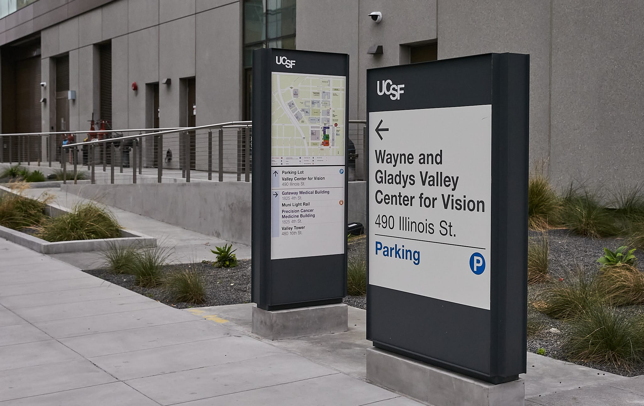
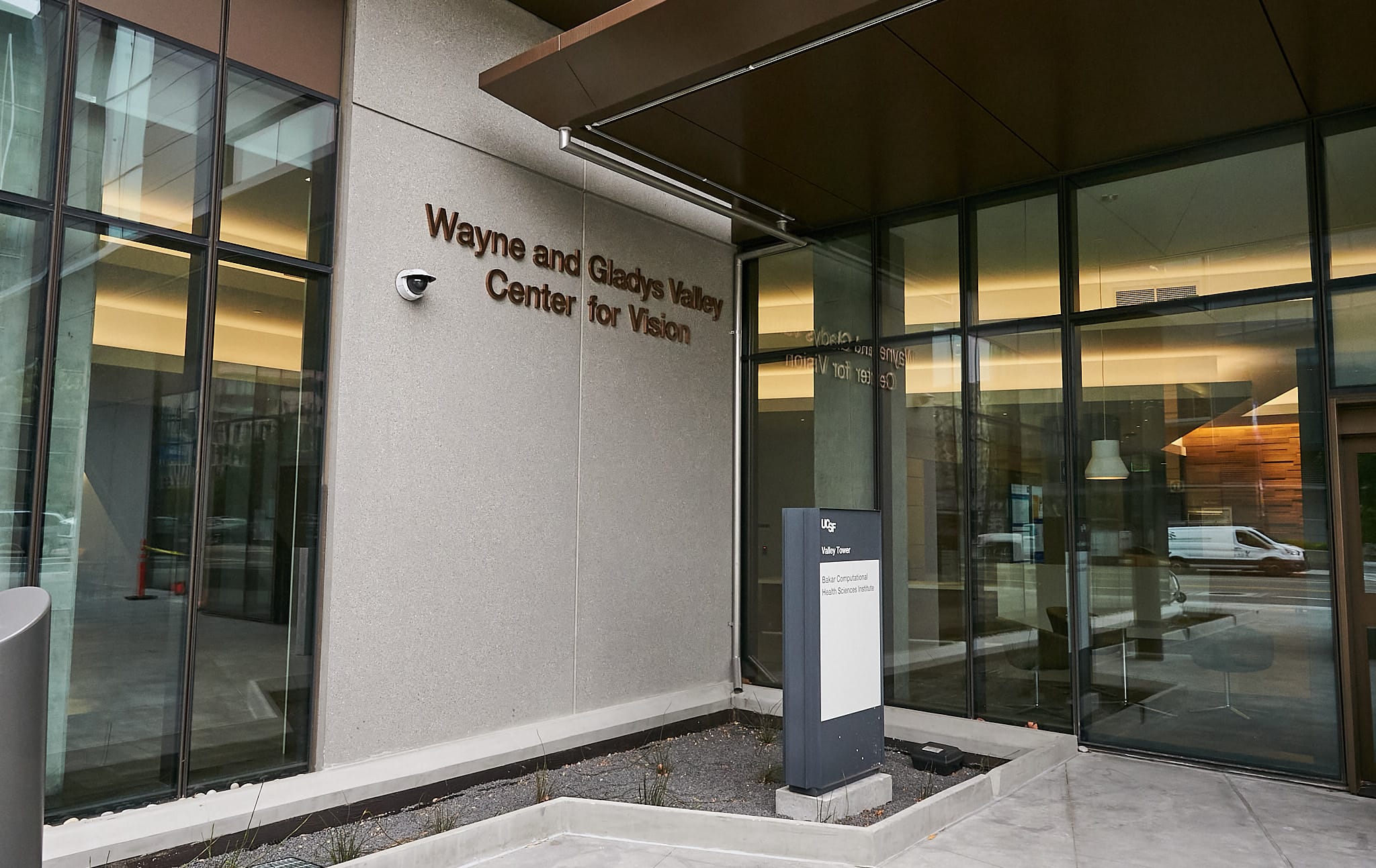
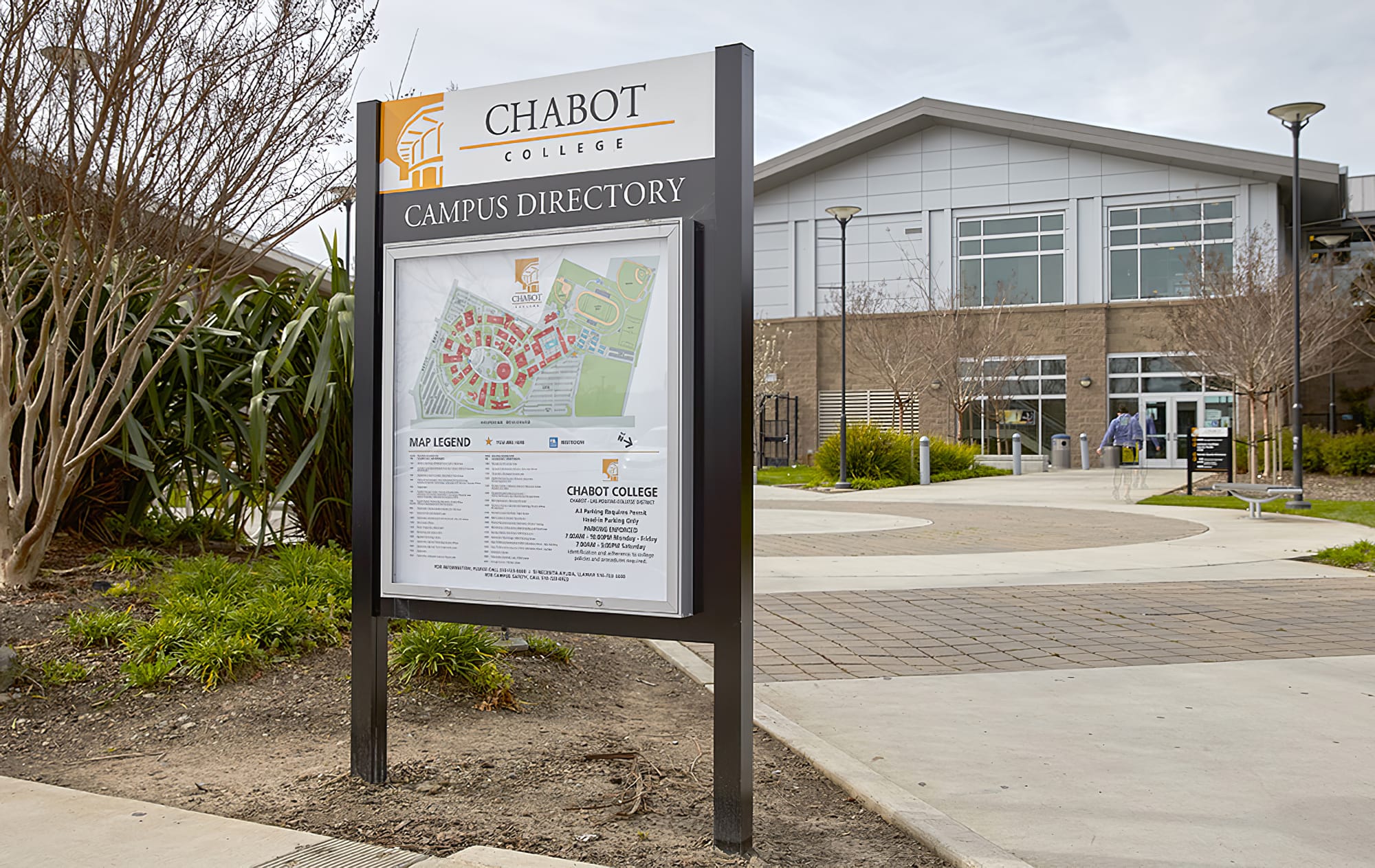
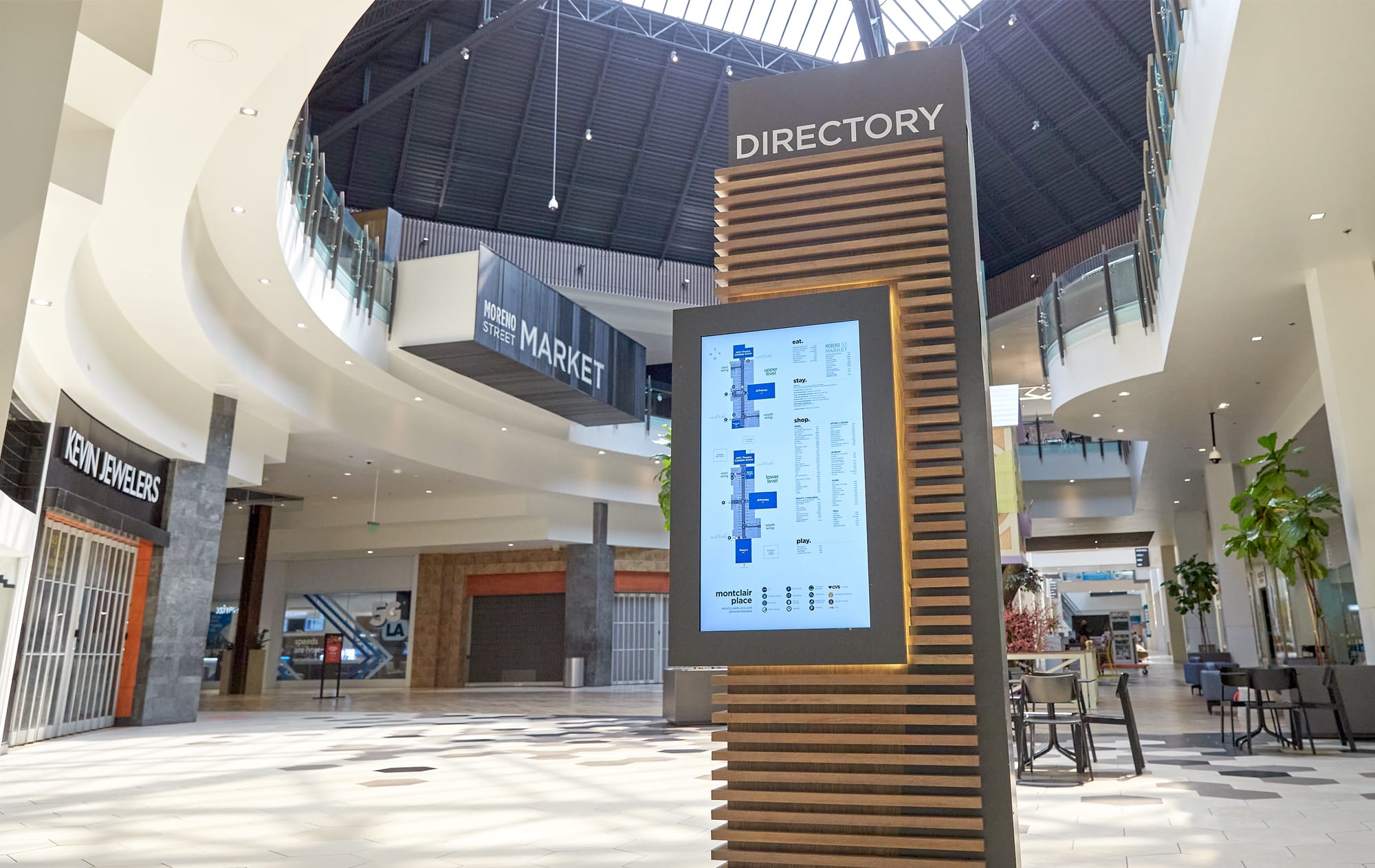








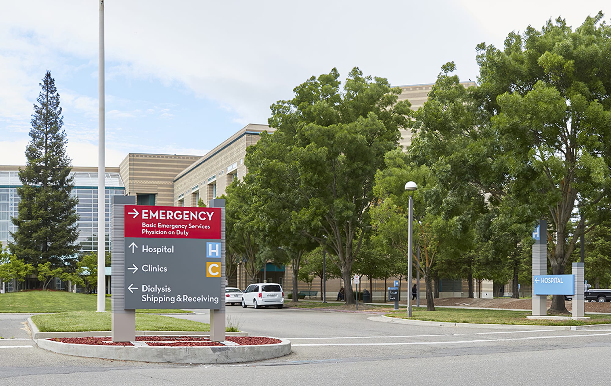
What are Wayfinding Signs and Why Do I Need Them?
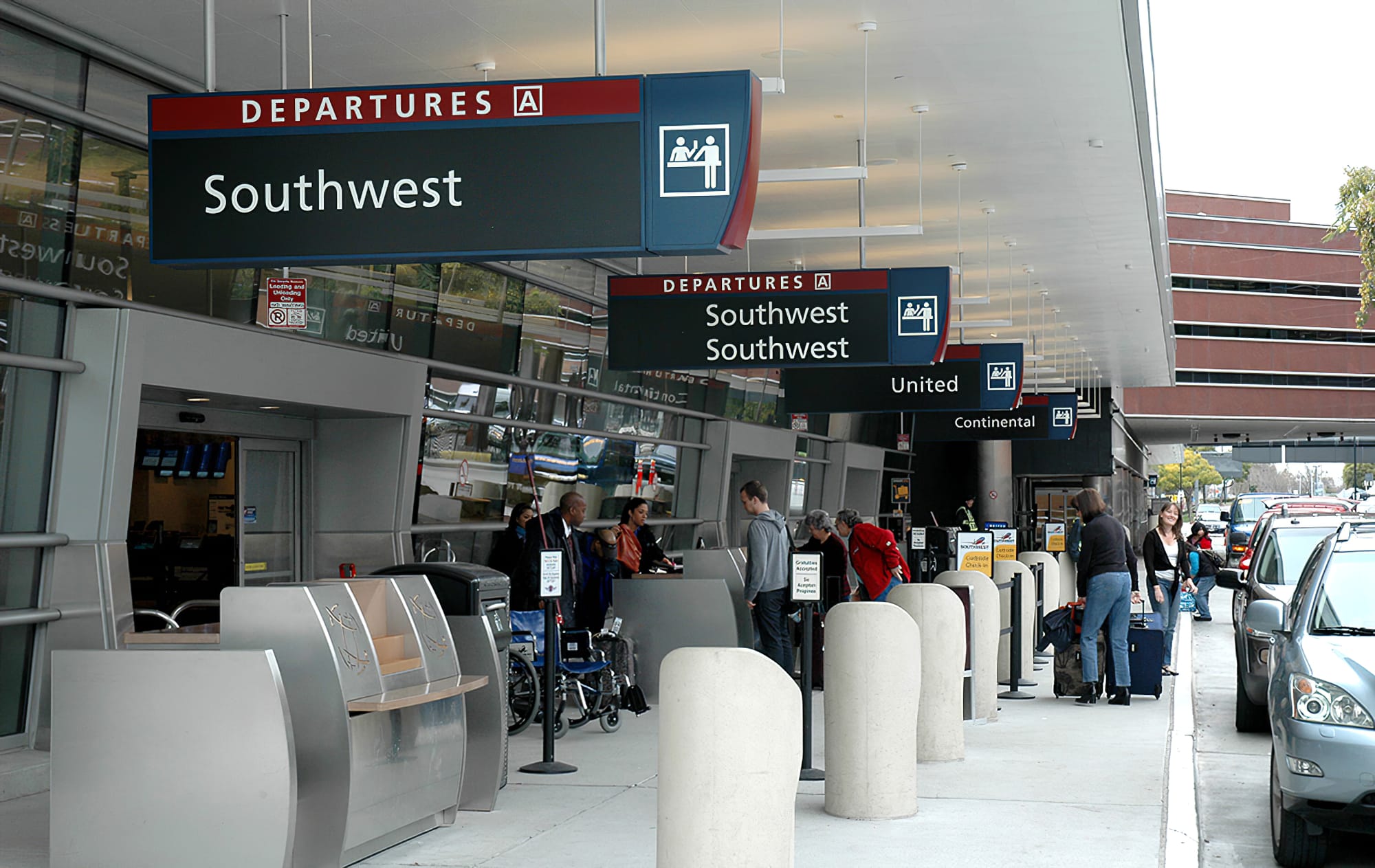
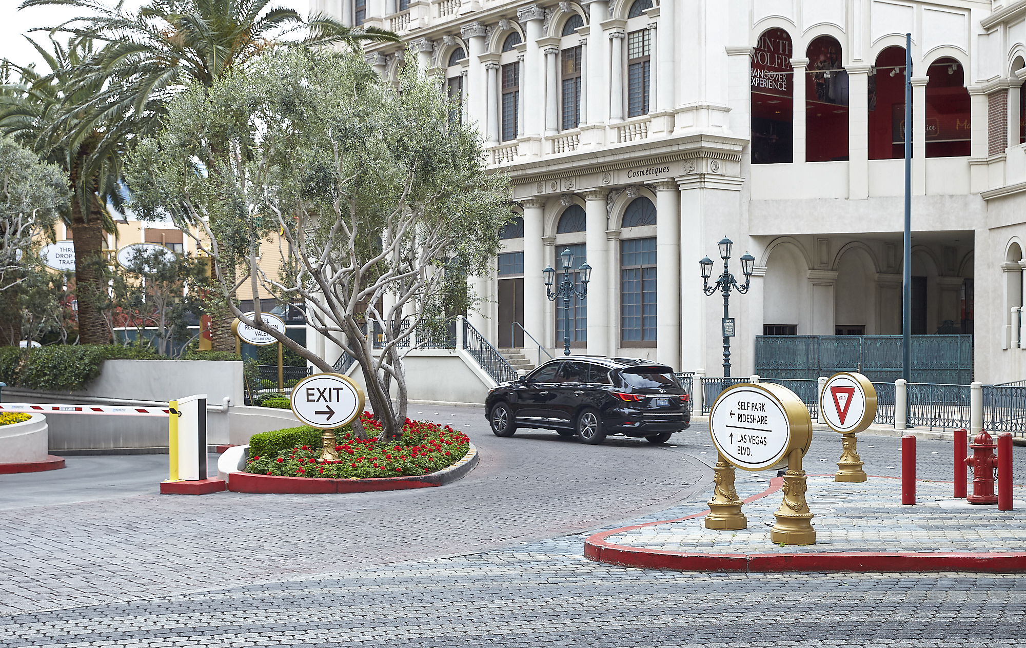
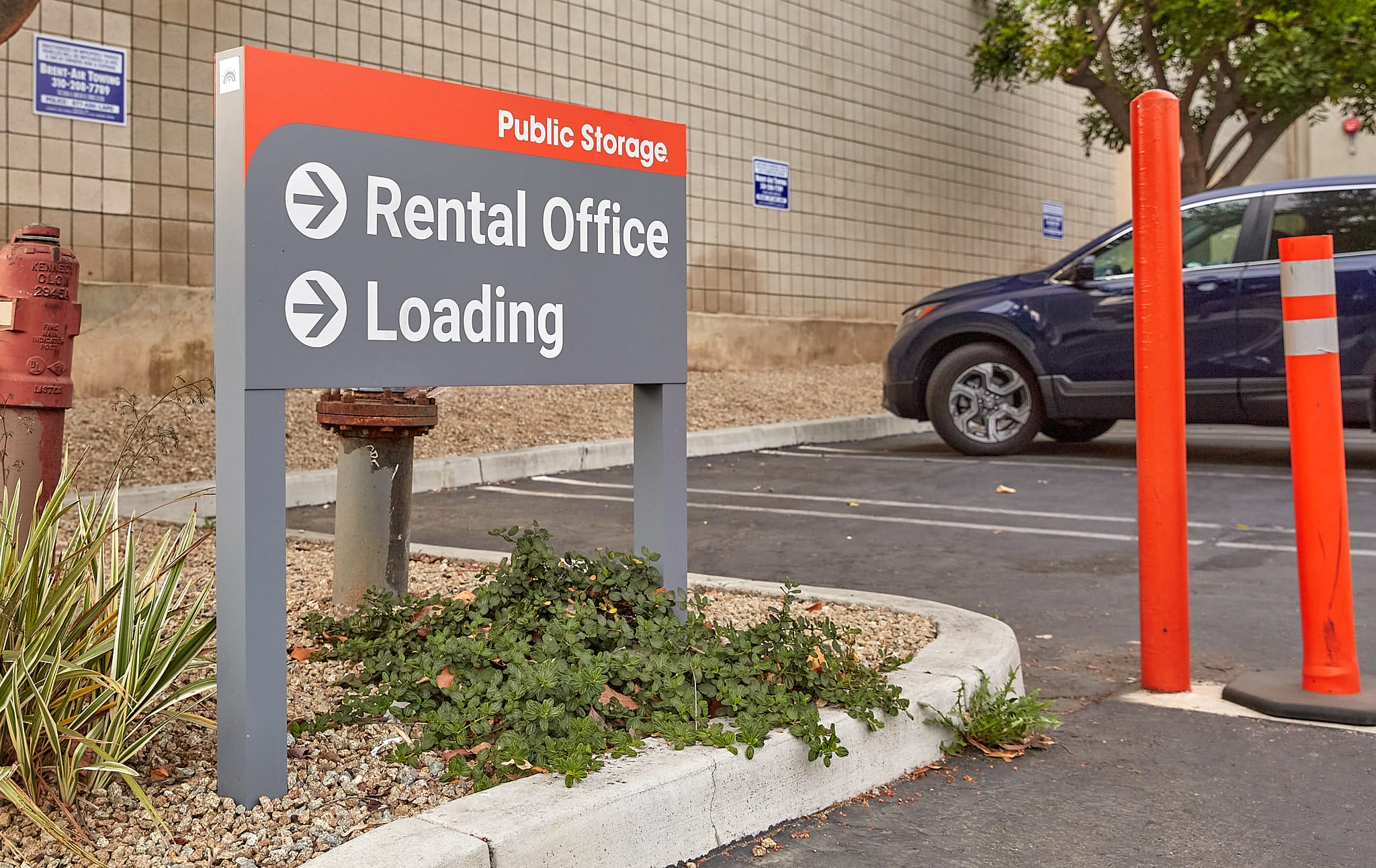
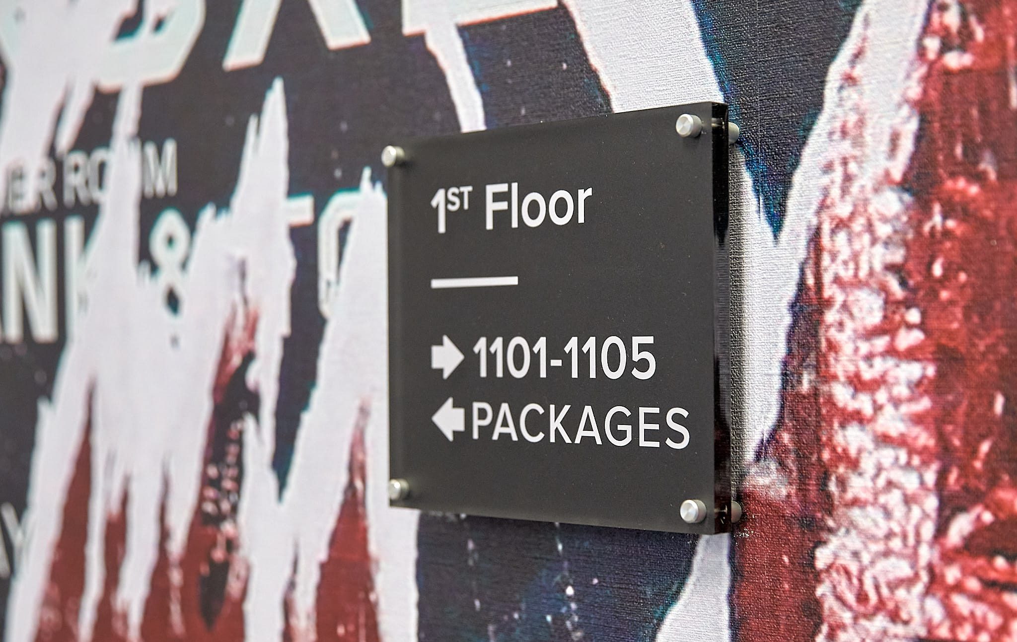
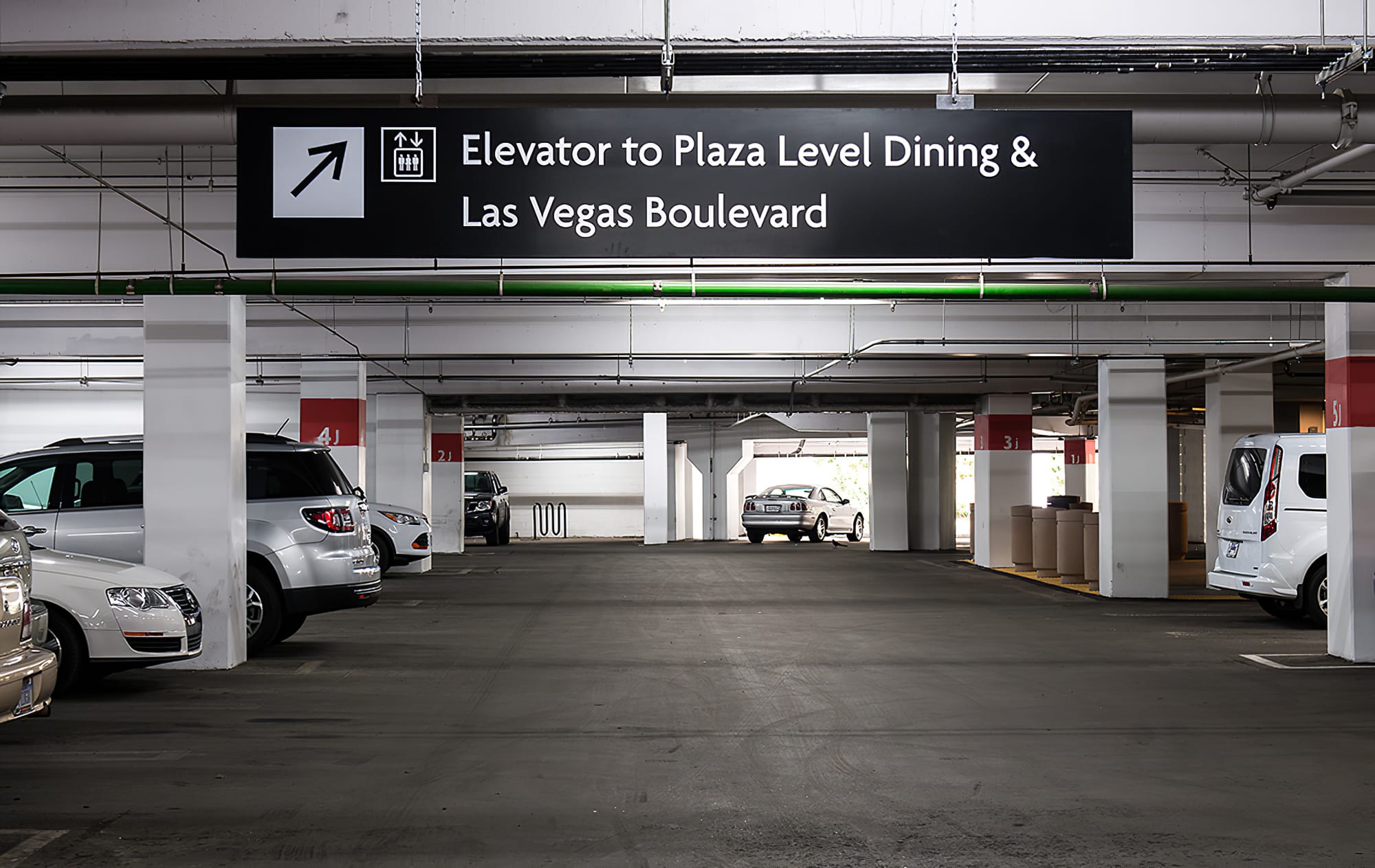
Wayfinding signs include any type of sign that gives direction. They exist to guide people to their destination on a property without lengthy explanations or complicated maps. Wayfinding signs should make it easy for people to find their way. Signs can be simple or ornate, illuminated or non-illuminated, and may include added features designed to meet your specific needs.
Wayfinding and directional signage is not a form of advertising or promoting. However, it does play an important role in portraying a positive company image. If you have effective and clear wayfinding signage, your customers will feel comfortable in your building. They will also feel empowered to find what they are looking for without having to ask for assistance.
Why choose this sign type over another and under what circumstances?
Since wayfinding signs help people find their way around any physical location, this type of signage is required, to some extent or another, at every business location. It will direct people from point to point and confirm their progress along a valid route. This type of signage is especially applicable for large, institutional buildings such as:
- Airports and transit centers
- Office and medical buildings (hospitals)
- Educational and financial institutions
- Tourist attractions
- Restaurants and bars
- Malls, retail outlets, and car dealerships
Different Types of Wayfinding Signs
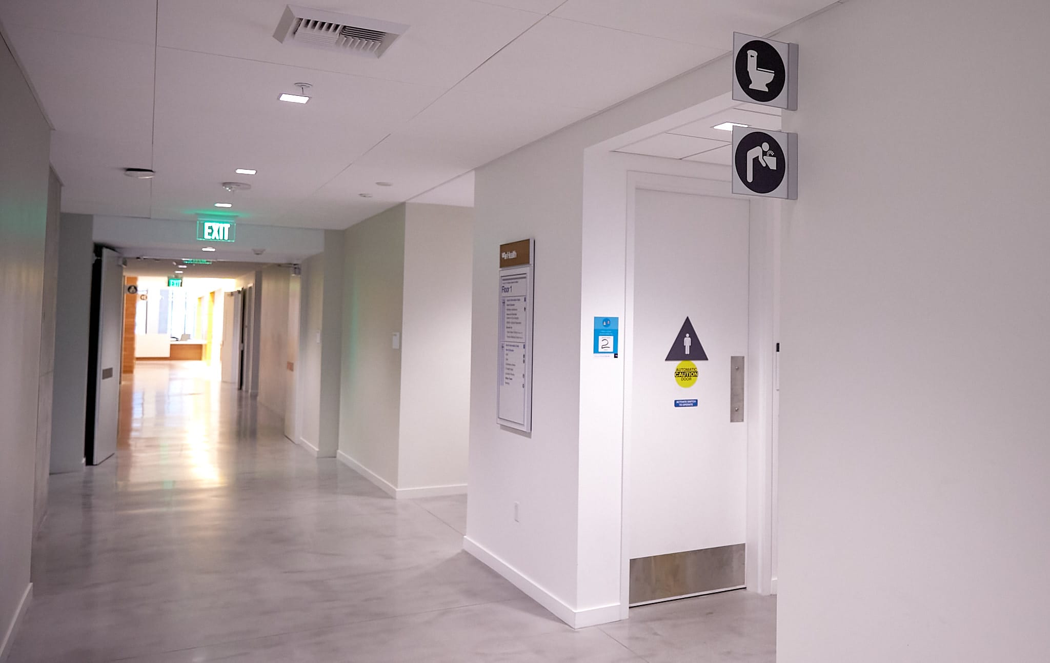
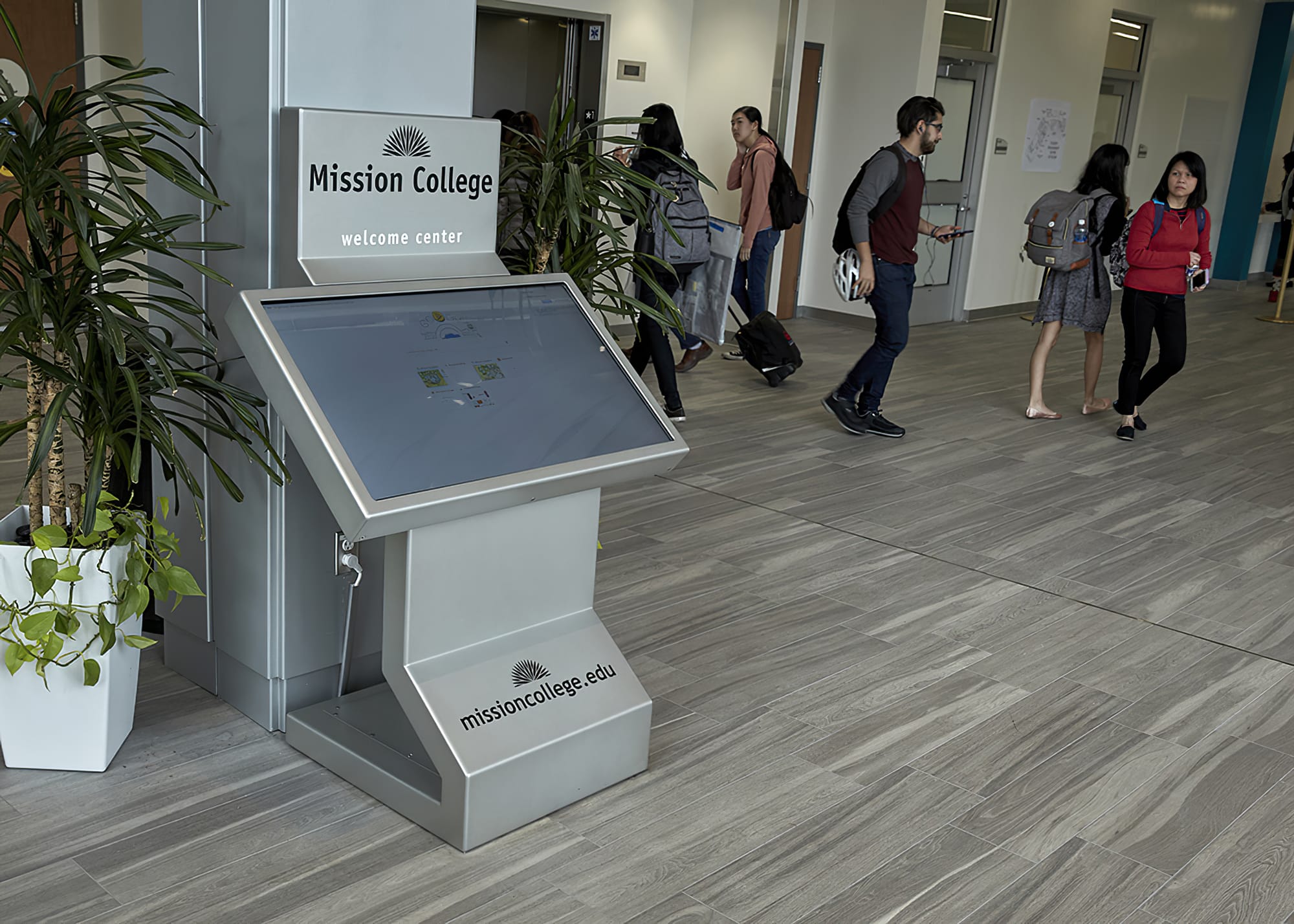
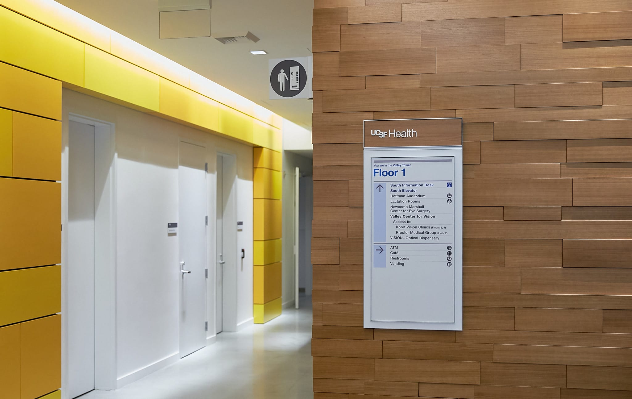
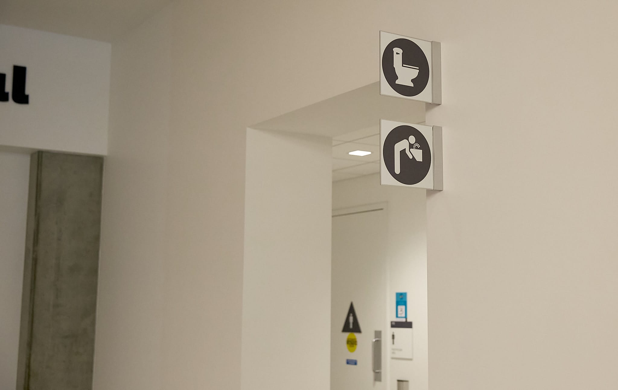
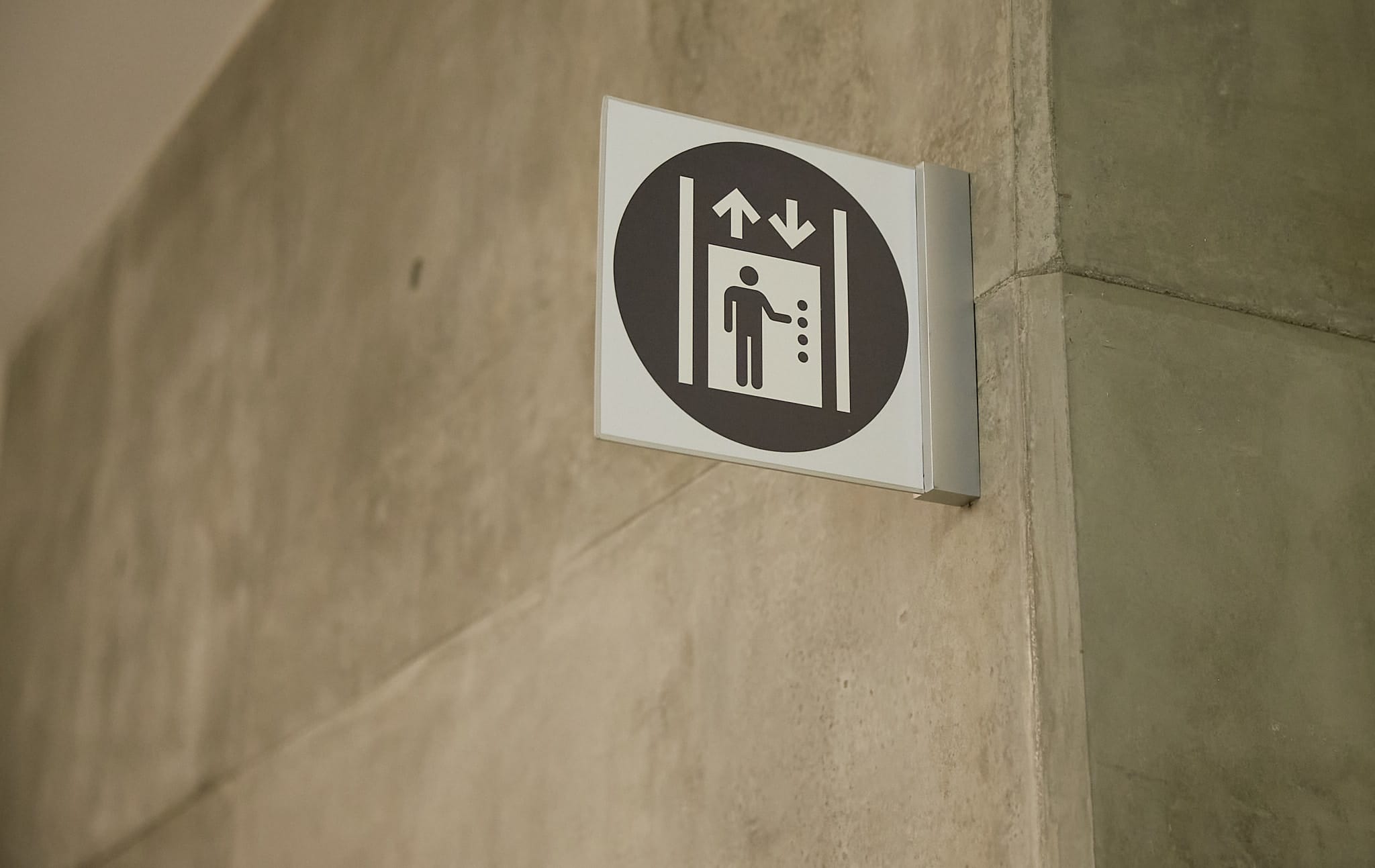
- Information signs: Informational signage pertains generally to the overall facility, instead of specific areas. These signs give people broad information they need while navigating. Informational signage is best placed in an area with broad exposure, like lobbies, waiting rooms, building entrances, and atriums. Informational signs should answer questions before they’re asked. For example: “Where are your bathrooms?” “How late are you open?” “Do you have an elevator?”
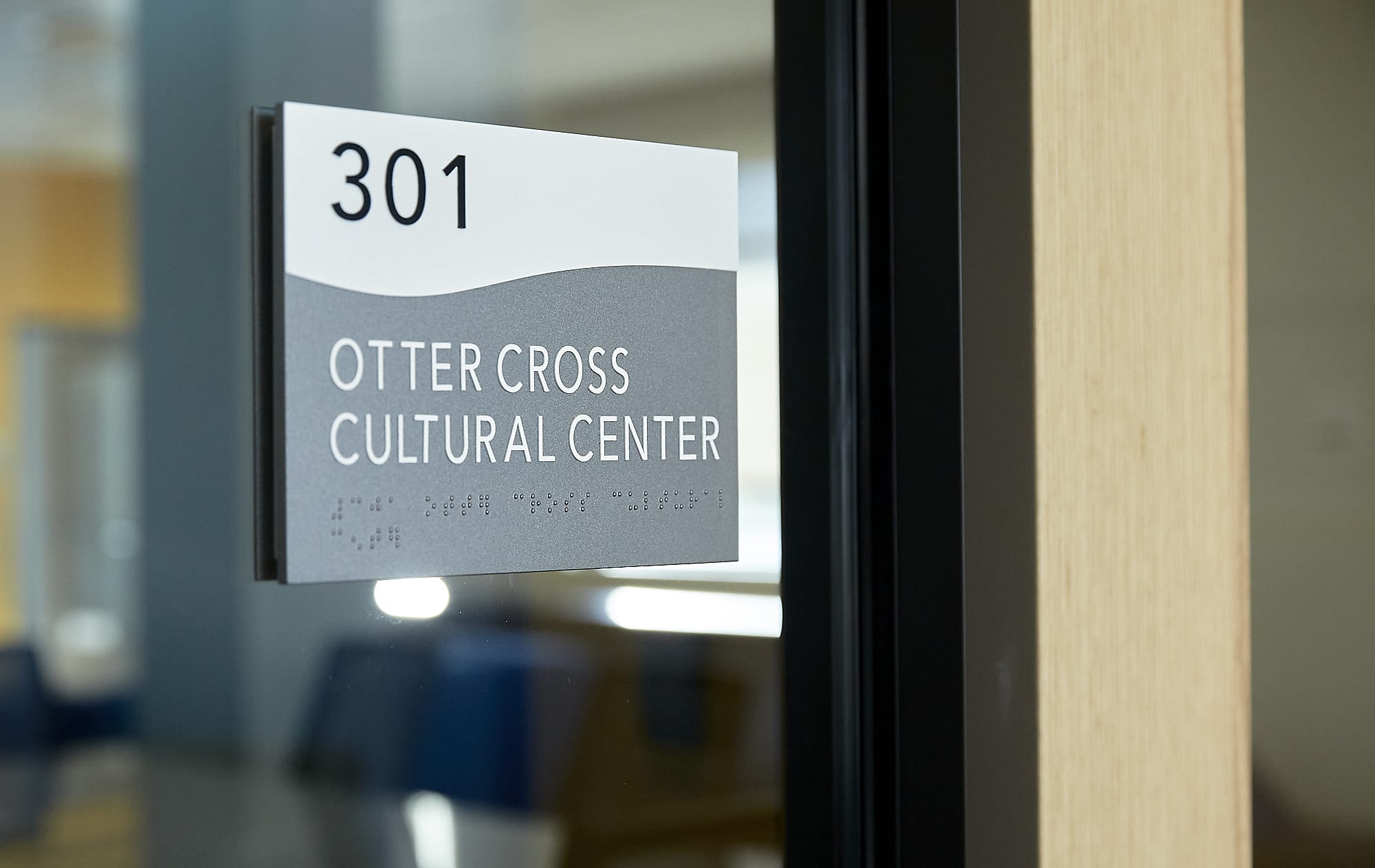
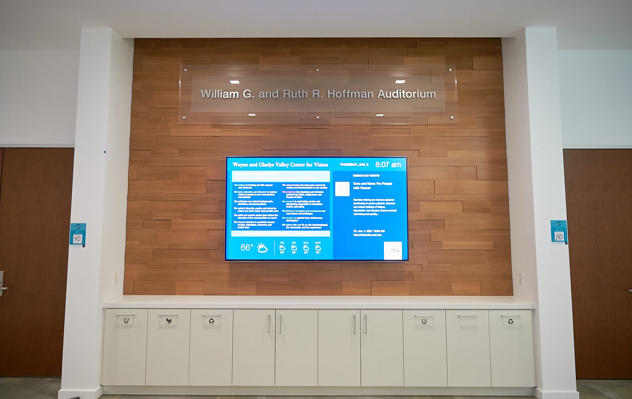
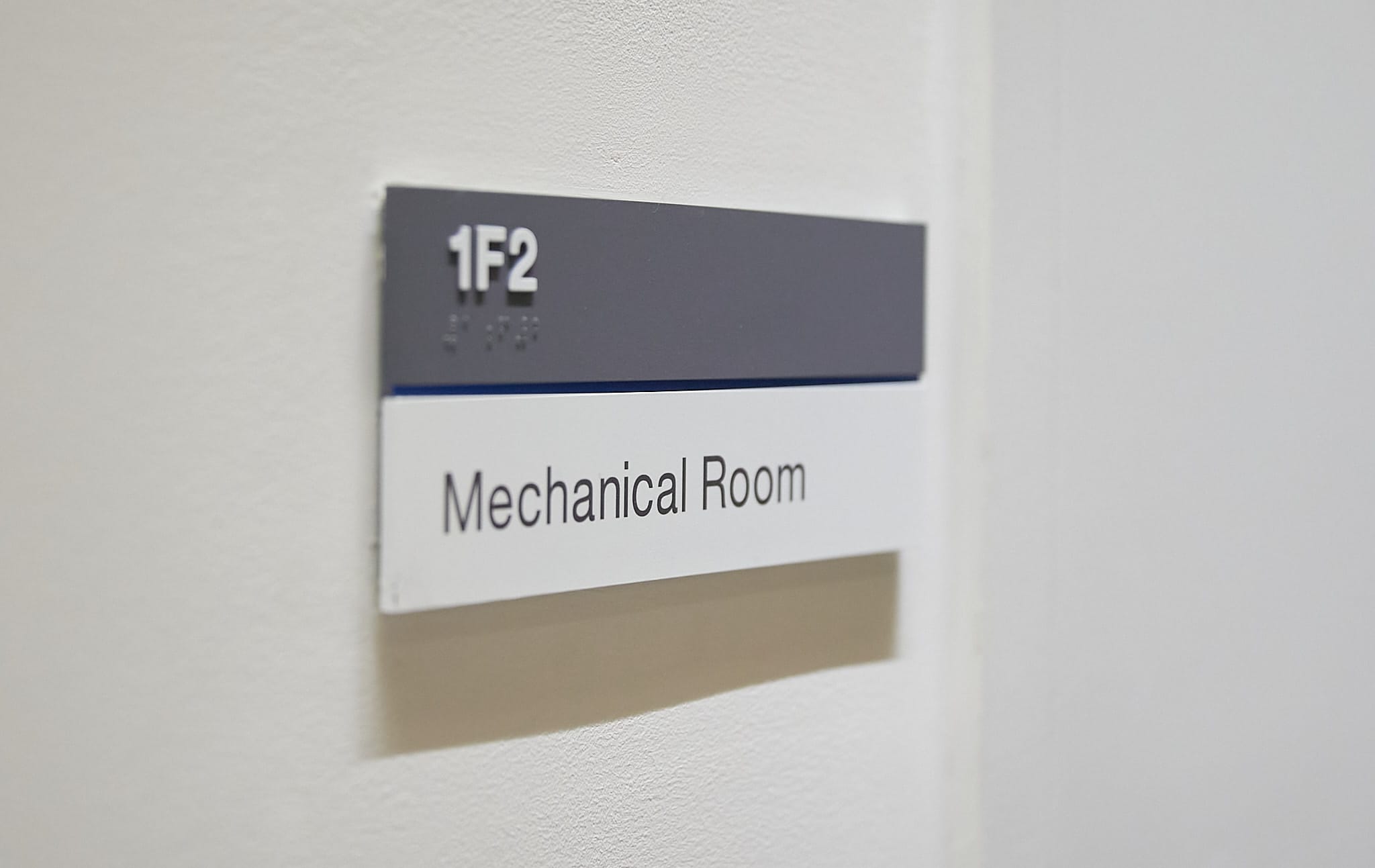
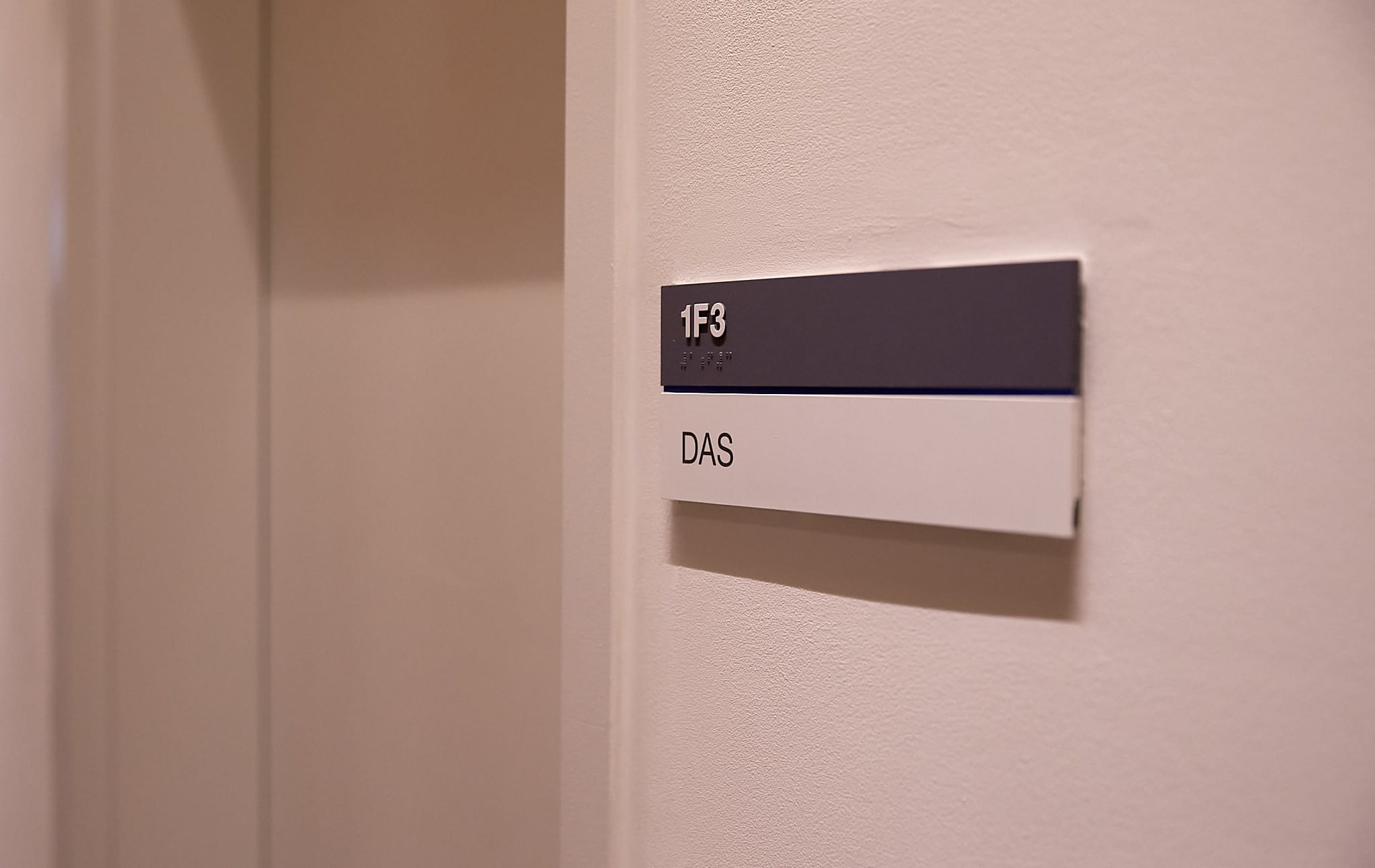
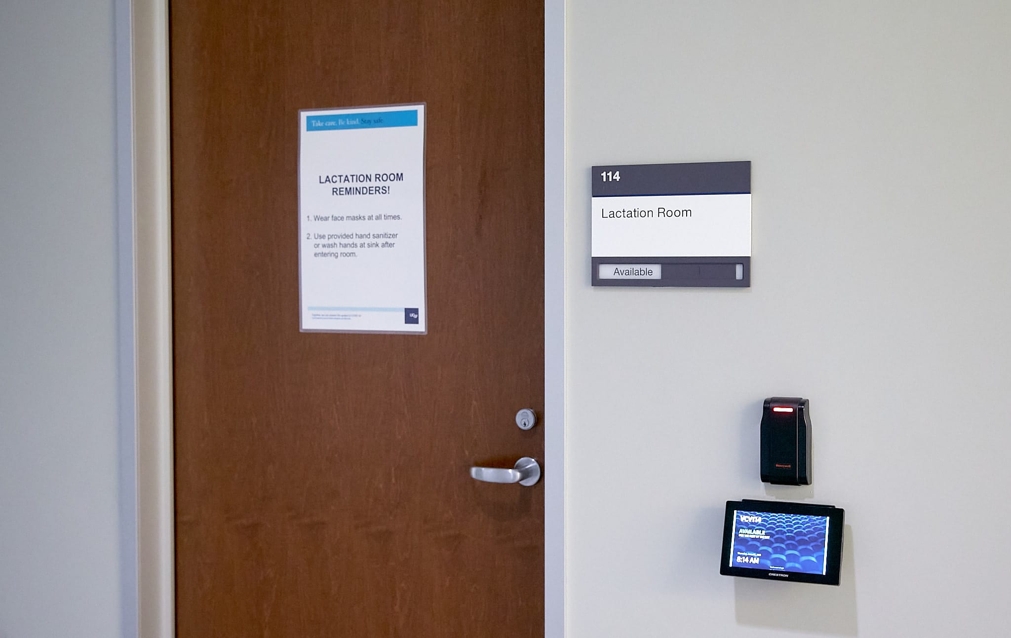
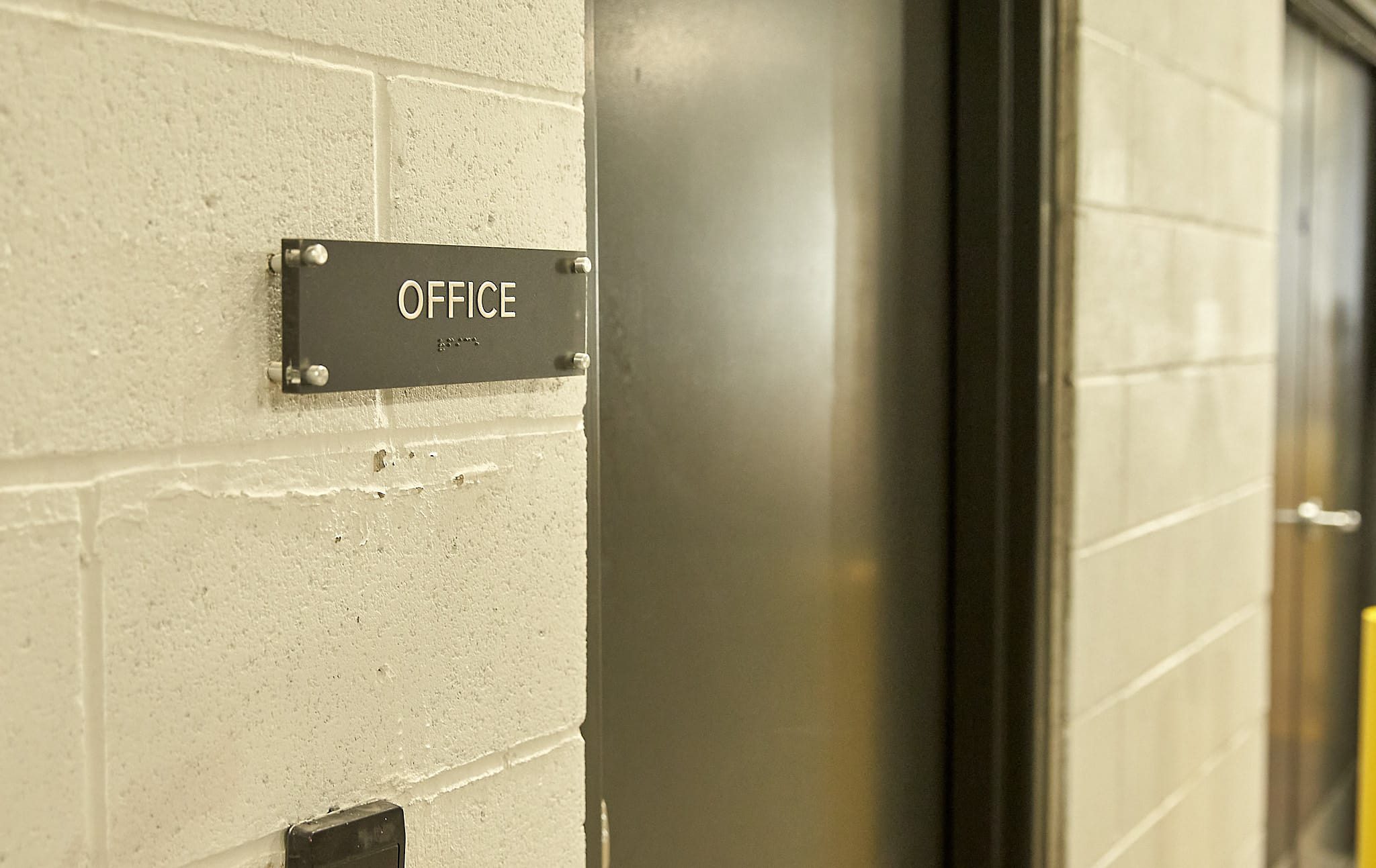
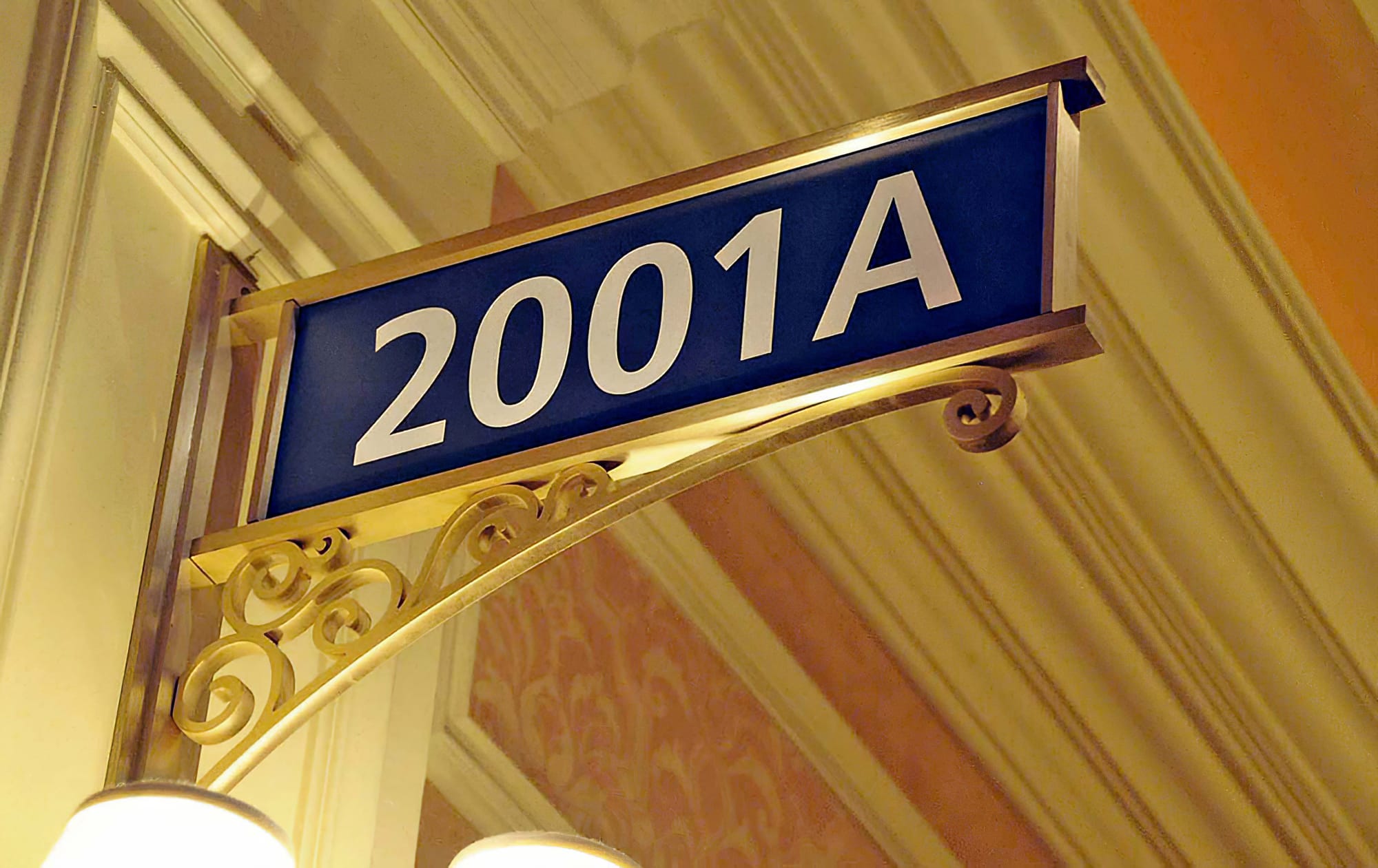
- Identification signs: Identification is the most common type of wayfinding sign. They tell a person when they have arrived at their destination. They also serve as general wayfinding landmarks.
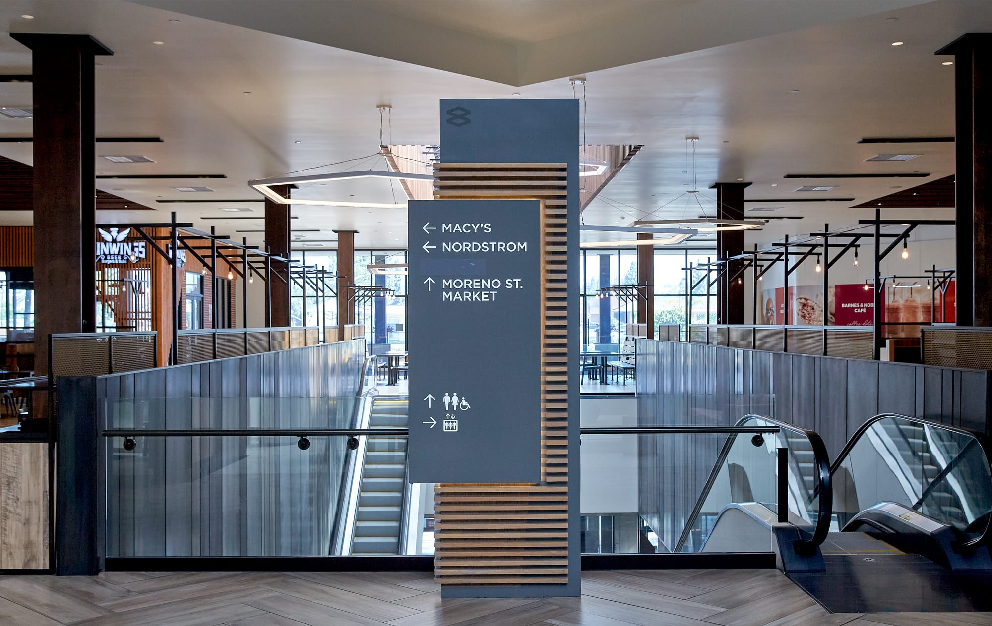
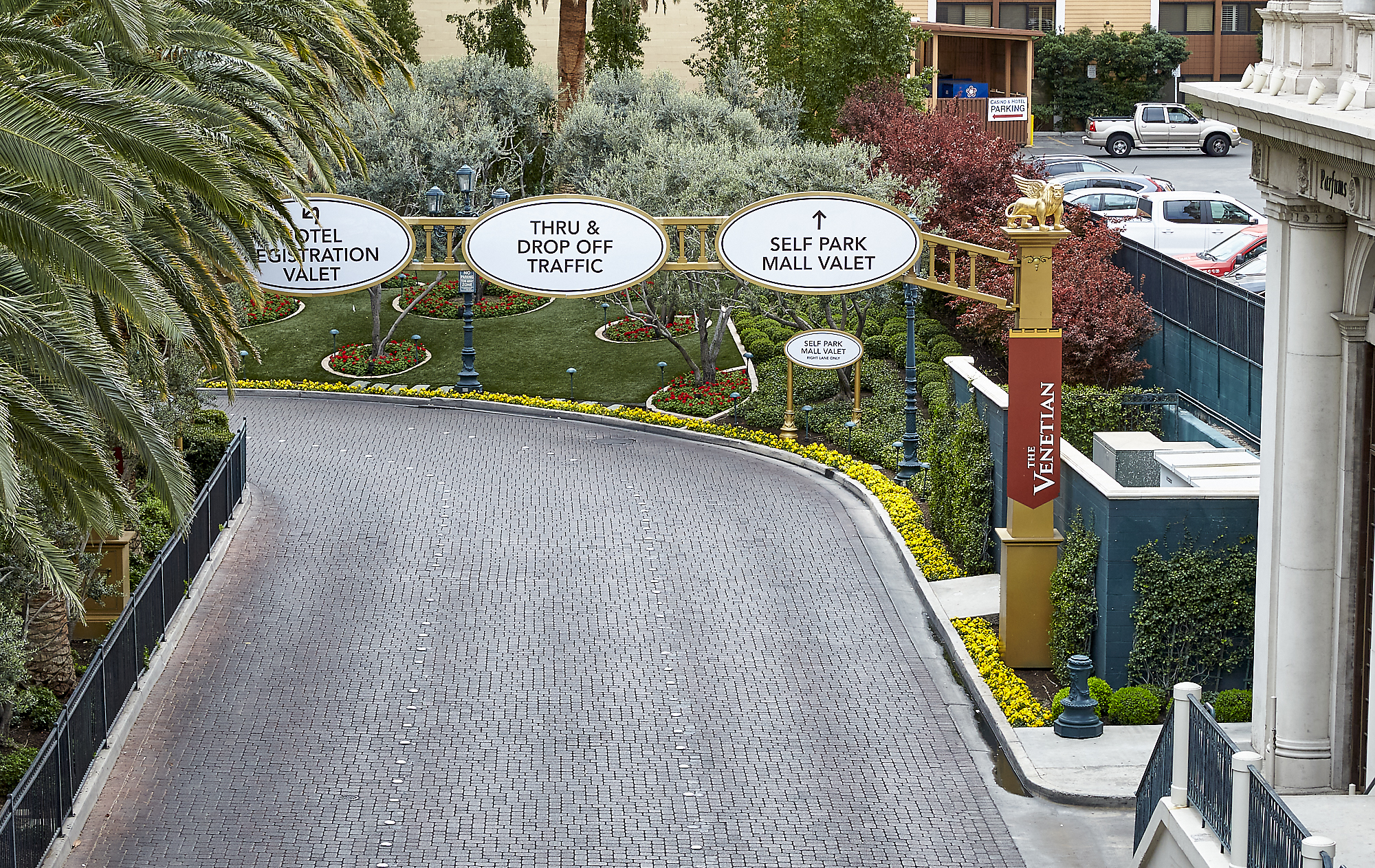
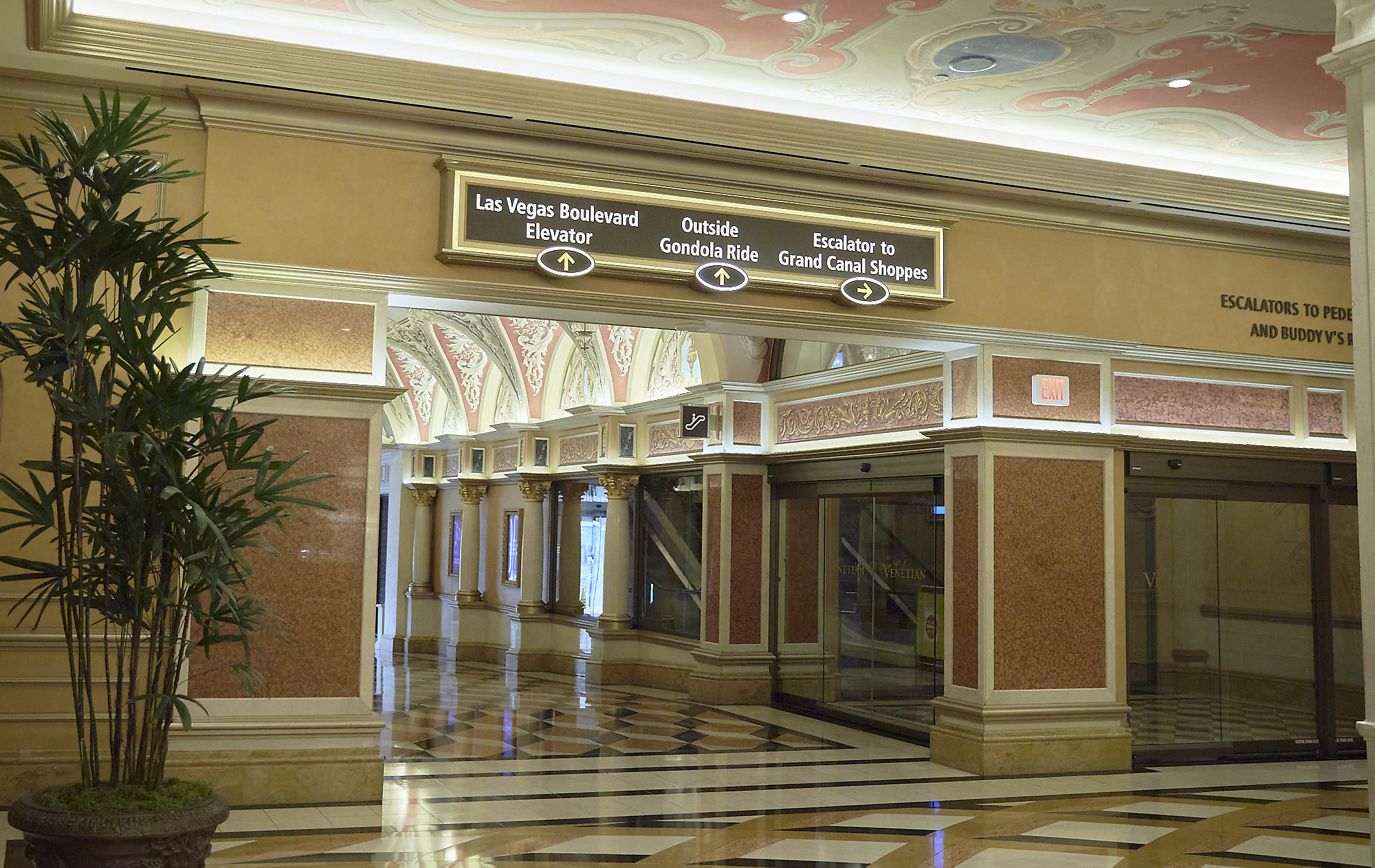
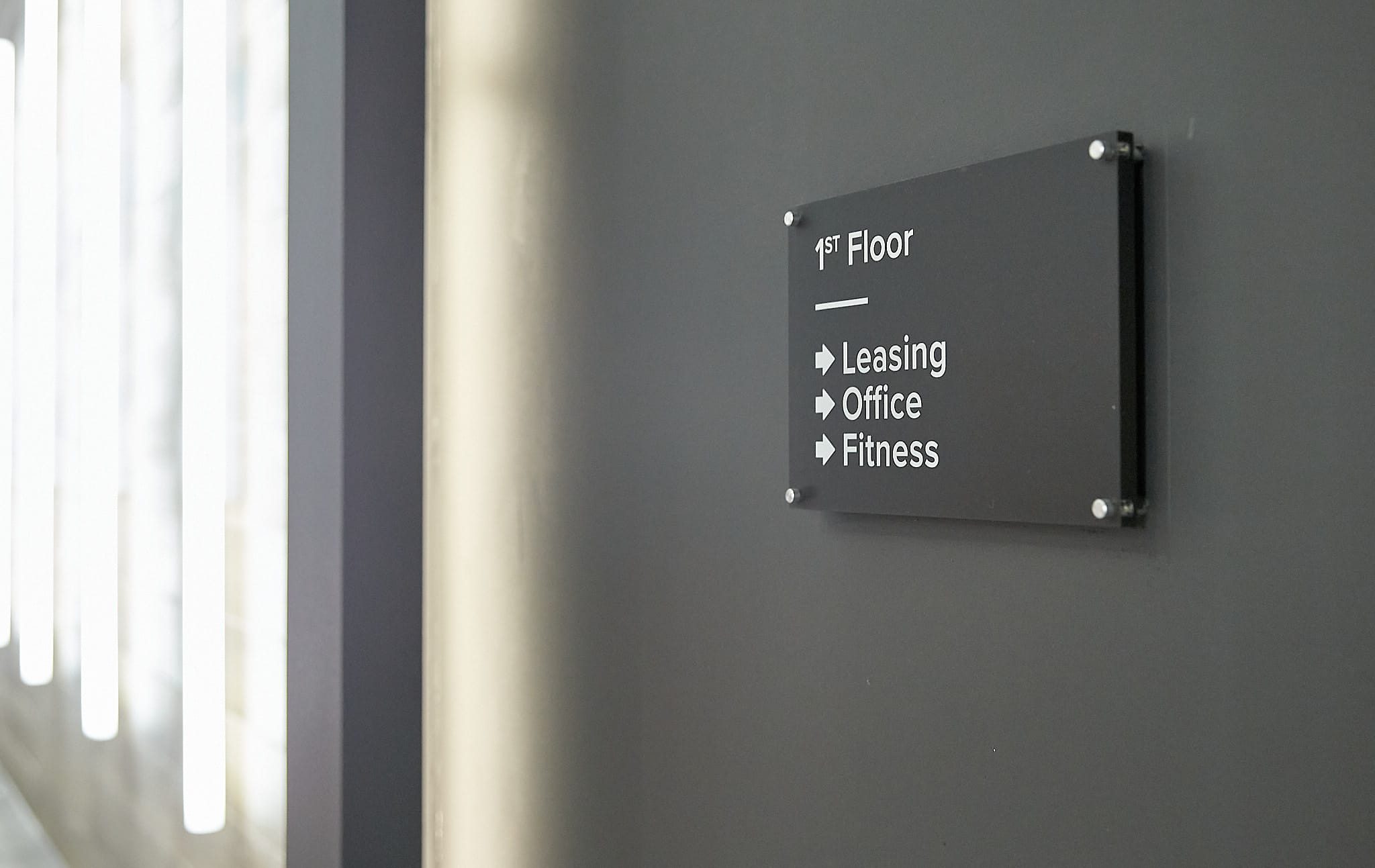
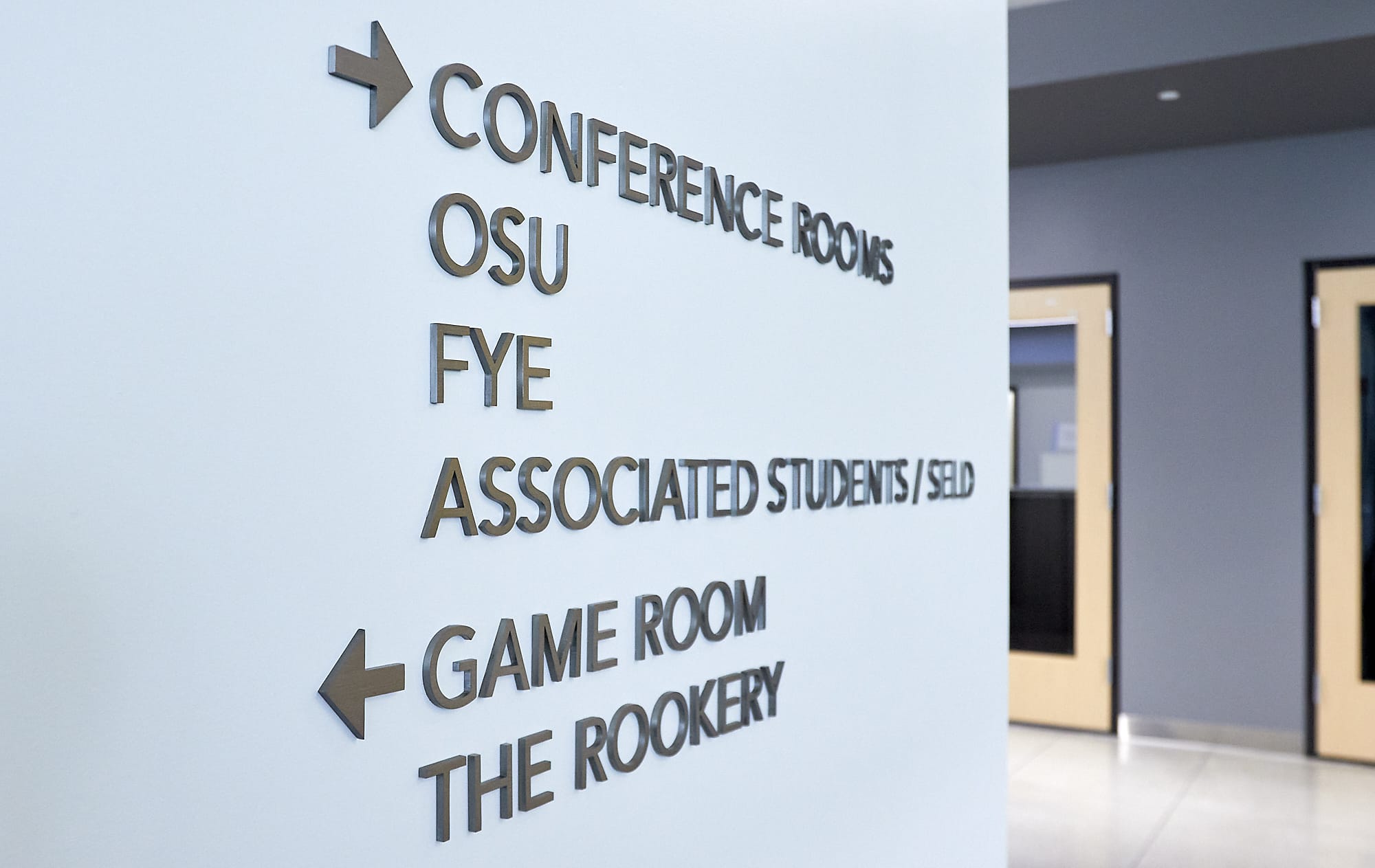
- Directional signs: Instead of answering general questions and identifying destinations, directional signage helps people get to where they’re going by showing them that they are making progress along the correct route. It’s an invisible hand guiding them from wherever they are to their destination, one step at a time. They’re best used at junctions and areas without a clear traffic flow. It can be as simple as a plaque at each junction sending people left or right. Or, it may be as comprehensive as sequential arrows leading people directly to their destination.
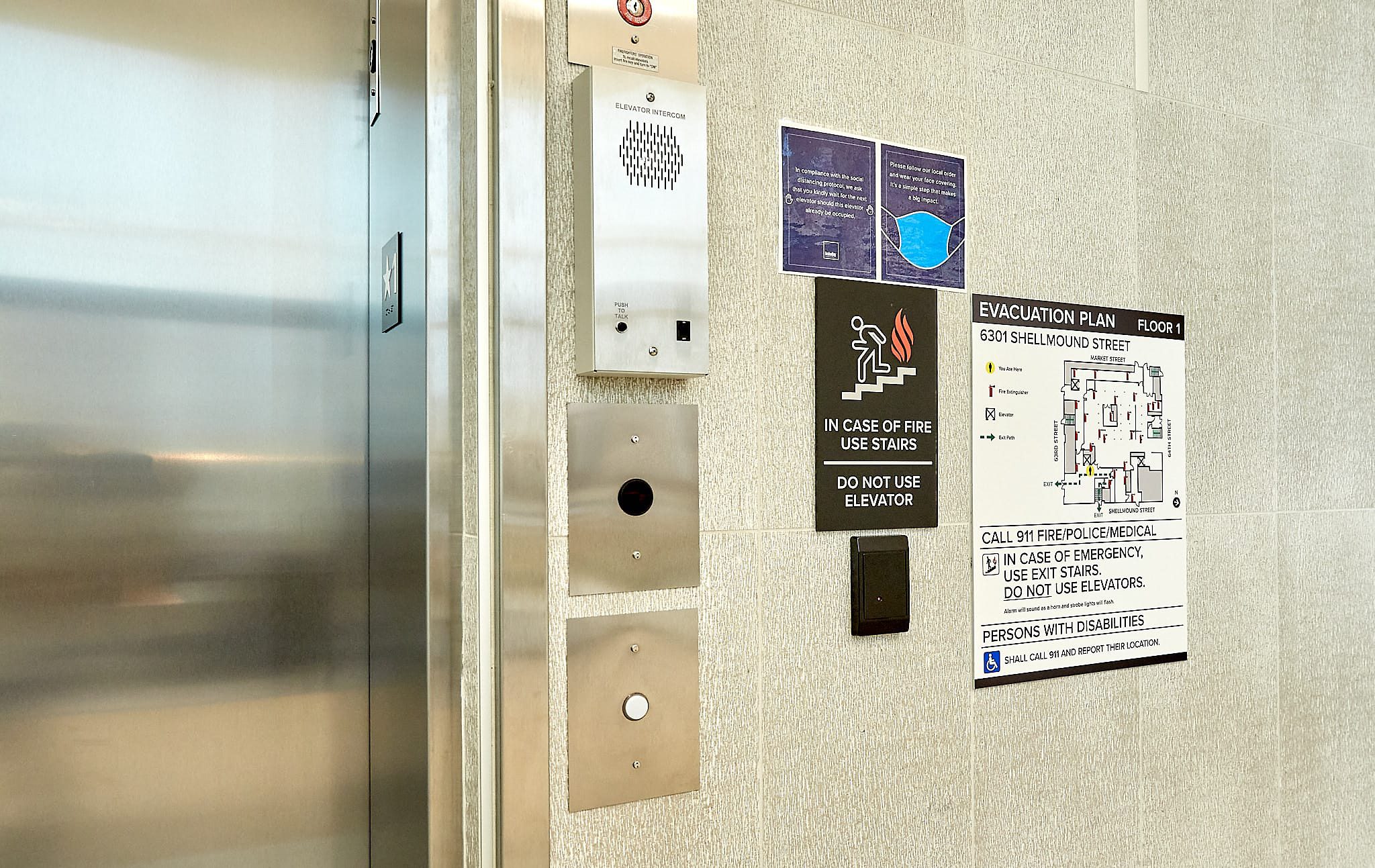
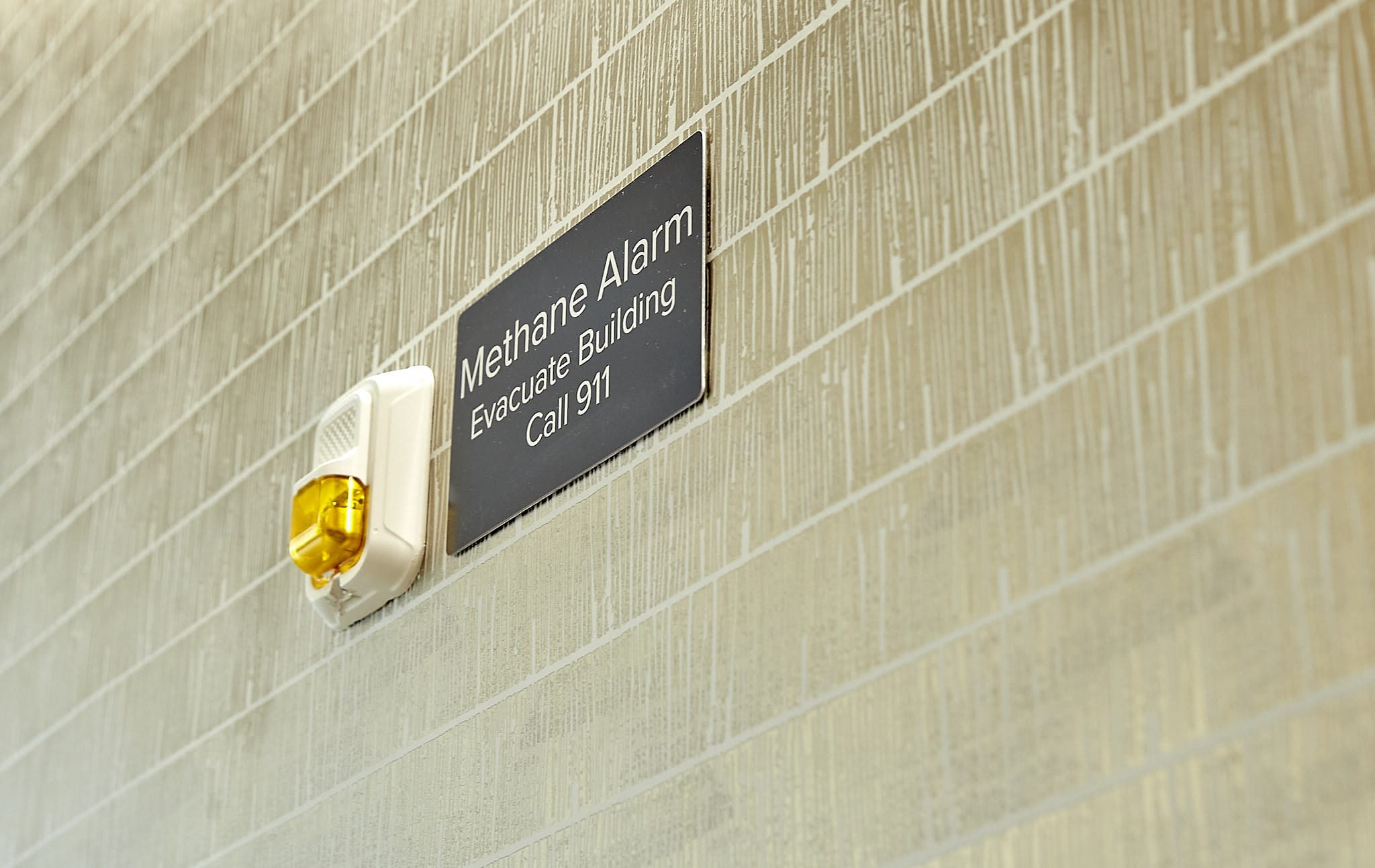
- Warning/regulatory signs: Warning signs are used solely for making customers aware of hazards in the area. Wet floor signs, fire safety signs, stairwell signs, etc. that mark a safety feature in a building are all extremely important. Regulatory signs also focus on safety and liability concerns, but are required by law to post. This type of signage will set boundaries for your visitors and let them know what is acceptable and where they can and cannot go. It’s used to establish and reinforce rules, safety standards, and privacy expectations.
How Ad Art Does Wayfinding Signs
Ad Art is all about value. We strive to be cost effective in everything we do so that every penny spent will bring optimal return on investment. Ad Art is known for creativity and innovation that helps set each customer’s sign apart from “ordinary” static signage. Quality, durability, and reliability are hallmarks of our products, which drives us to take pride in our work. We look good when our customers look good.
Below are some best practices Ad Art follows when designing, fabricating, and installing wayfinding signs:
- Consistent branding: Wayfinding signage will be immediately recognizable. Consistency across all wayfinding markers and guideposts helps visitors quickly spot and understand these markers.
- Keep it simple: Overly complicated wayfinding signage is confusing. People will be able to spot signage and process information in seconds, so messaging is clear and to-the-point. Identification signs will be straightforward and uncluttered so that they can be understood in just a few seconds.
- Color coding: Colors, along with words, symbols, and shapes, are important variables in delineating signage. Color-coding will be kept consistent and purposeful. Color keys will be provided as needed for easy reference.
- Visuals cues: Symbols and shapes can quickly say what words are too cumbersome to communicate. They’re also a great way to simplify signage and wayfinding design. Ad Art will use symbols and language that can be easily and universally understood by everyone, at a glance.
- Proper placement: Wayfinding signage is only as effective as its placement. No one will see signs if they’re out of the normal sightline. Ad Art will make overhead signs prominent, hang wall placards at eye-level, and display all signage at junctions where visitors need direction. Informational signs will be placed in areas where a large number of people will be able to see it – such as lobbies, waiting rooms, and entrances. Directional signs will be placed in areas where there isn’t a clear traffic flow, or multiple traffic directions.
- Mapping routes: All wayfinding signage will be connected, meaning every sign will lead to the next one, regardless of the destination. If there are gaps in the route, too much distance between signs, poor display of signage, or lack of context, then visitors will lose their way. Ad Art will avoid those scenarios.
- Follow the rules: Ad Art will use regulatory signage wherever it applies and will leave no room for ambiguity. Regulatory signs will be prominent, clear and concise.
- Provide answers: When designing informational signs, Ad Art will think about the types of questions that visitors would be asking and will make signage that gives clear answers to those questions.
